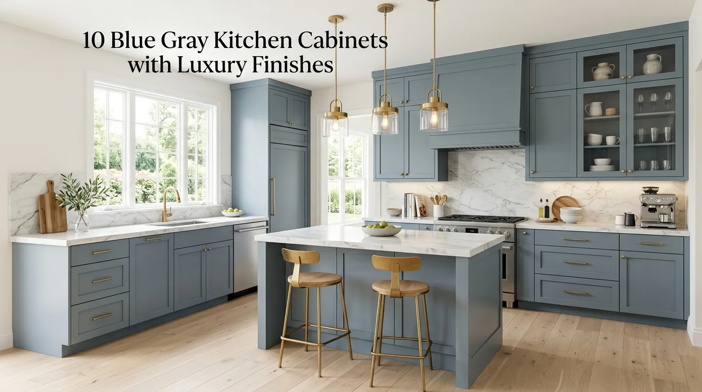
10 Blue Gray Kitchen Cabinets with Luxury Finishes
Blue gray has quietly become one of the most requested kitchen cabinet colors among homeowners who want something more distinctive than classic white, but still calm and timeless enough to live with for years. In my experience, this particular color family works so well specifically because it sits right at the intersection of warm and cool — it reads as sophisticated rather than trendy, and it pairs beautifully with nearly every metal finish, countertop material, and hardware style currently popular in luxury kitchen design.
If you’re anything like me, you’ve probably noticed that not every blue gray kitchen photographed on Pinterest actually looks “luxury,” even when the cabinet color itself is beautiful. A mistake many homeowners make is choosing the right cabinet color but pairing it with builder-grade hardware, flat countertops, and standard lighting, which undercuts the elevated look the color alone is capable of achieving. The finish details — hardware, countertop veining, lighting, and backsplash material — are what actually push a blue gray kitchen from pleasant to genuinely luxurious.
That’s why many designers recommend choosing the cabinet color last, after deciding on the finish level you’re aiming for, rather than picking the paint color first and figuring out the rest of the kitchen around it. I’ve noticed that the blue gray kitchens people save most often on Pinterest share a consistent formula: a rich, complex cabinet tone rather than a flat, single-note blue gray, paired with warm metal hardware, natural stone or quartz with visible movement, and layered lighting that highlights the cabinet’s depth rather than flattening it.
In this guide, I’m sharing ten blue gray kitchen cabinet ideas built specifically around luxury finish choices — hardware, countertops, backsplash, and lighting pairings that elevate the color rather than leaving it to do all the work alone. Each idea includes practical guidance on the specific finishes and materials that make each look come together.
Table of Contents
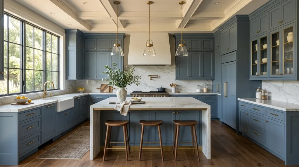
- Slate Blue with Brushed Brass Hardware A rich, moody tone paired with warm metal accents.
- Soft Denim Blue with Marble Waterfall Island A dramatic centerpiece built around a striking stone.
- Charcoal Blue Gray with Matte Black Fixtures A bold, high-contrast modern combination.
- Dusty Blue with Polished Nickel Details A soft, elegant pairing for a timeless kitchen.
- Two-Tone Blue Gray and Warm Wood A layered cabinet scheme with natural wood contrast.
- Navy-Leaning Blue Gray Island Accent A bold island statement against neutral perimeter cabinets.
- Blue Gray with Antique Brass and Glass Fronts A refined, vintage-inspired luxury combination.
- Coastal Blue Gray with Honed Marble A soft, textural pairing for a relaxed luxury feel.
- Deep Storm Blue with Gold Accent Lighting A dramatic, jewel-toned kitchen statement.
- Blue Gray Shaker with Statement Range Hood A classic cabinet style elevated by a bold focal point.
1. Slate Blue with Brushed Brass Hardware
Quick Benefits
- Rich, complex tone with real depth
- Warm hardware balances the cool cabinet color
- Timeless pairing that won’t feel dated quickly
- Works beautifully in both large and small kitchens
- Elevates a standard cabinet shape into something custom-feeling
Why It Works
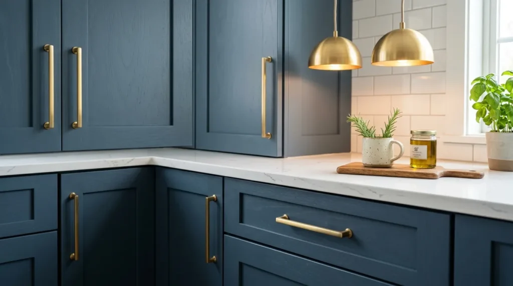
Slate blue is one of the more sophisticated shades within the blue gray family, carrying enough depth and complexity that it reads as a genuinely custom color rather than something flat or one-note. In my experience, this is the tone that photographs best in natural light specifically, since it shifts subtly between blue and gray depending on the time of day, which gives the kitchen a sense of richness that a simpler, single-note color can’t achieve. Pairing it with brushed brass hardware is what pushes the whole look into luxury territory, since the warm metal tone keeps the cool cabinet color from feeling sterile or cold.
How To Style It
Choose a slate blue cabinet paint or stain with visible depth and slight variation rather than a completely flat, matte finish, and pair it with brushed brass cabinet pulls and knobs in a simple, substantial silhouette. Carry the brass finish through to faucet fixtures and pendant lighting for a cohesive metal story throughout the room. This pairing works especially well with white or light gray quartz countertops, which let the cabinet color and brass hardware remain the visual focus rather than competing with a busier stone pattern.
2. Soft Denim Blue with Marble Waterfall Island
Quick Benefits
- Dramatic centerpiece built around stone veining
- Softer blue gray tone for a relaxed luxury feel
- Waterfall edge adds architectural sophistication
- Works beautifully in open-concept kitchens
- Creates a genuine visual focal point
Why It Works
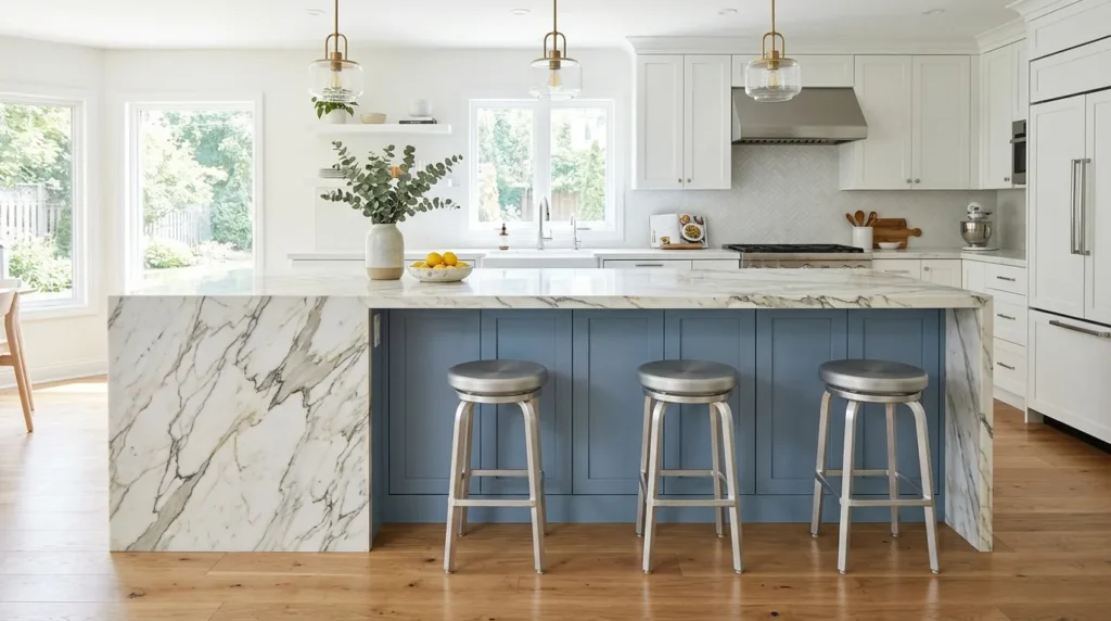
A soft, muted denim blue on cabinetry provides a calm, understated backdrop that lets a dramatic marble waterfall island countertop take center stage as the kitchen’s true showpiece. That’s why many designers recommend this specific pairing for open-concept kitchens, where the island is visible from the living or dining space and needs to function as a genuine design statement, not just a functional work surface. The softer cabinet tone ensures the marble’s veining remains the star of the room rather than competing with a bolder, more saturated cabinet color.
How To Style It
Choose a soft, slightly desaturated denim blue for the perimeter cabinetry, and install a marble or marble-look quartz countertop with dramatic, flowing veining on the island specifically, extending the stone down the sides in a waterfall edge for maximum visual impact. Keep perimeter countertops simpler — a plain white quartz or a subtler stone pattern — so the island’s marble remains the clear focal point. Pair with polished chrome or brushed nickel fixtures, which complement the cool tones in both the cabinet color and the marble veining better than a warmer metal finish would.
3. Charcoal Blue Gray with Matte Black Fixtures
Quick Benefits
- Bold, high-contrast modern statement
- Sophisticated, moody atmosphere
- Matte black fixtures add sleek definition
- Works beautifully with brass or gold accent lighting
- Distinct from lighter, more common blue gray kitchens
Why It Works
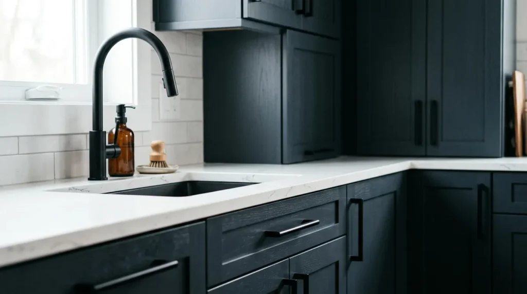
A deeper, charcoal-leaning blue gray brings serious drama and moodiness to a kitchen, standing apart from the lighter, softer blue grays that dominate most kitchen design content. I’ve seen this darker tone used especially effectively in kitchens with abundant natural light, where the deep cabinet color doesn’t read as heavy or closed-in the way it might in a dimmer space. Matte black fixtures reinforce the same bold, modern sensibility, creating a cohesive, confident look rather than one that feels tentative or overly safe.
How To Style It
Choose a charcoal-leaning blue gray, deep enough to read as nearly black in low light but with a clear blue undertone visible in brighter conditions, and pair it with matte black faucet fixtures, cabinet hardware, and window frames if possible for a fully cohesive dark accent story. Balance the deep cabinet color with a lighter countertop — a white or pale gray quartz with subtle veining keeps the kitchen from feeling overly dark overall. Adding a few brass or gold accent light fixtures against the black hardware introduces warmth and prevents the color scheme from feeling one-dimensionally cool.
4. Dusty Blue with Polished Nickel Details
Quick Benefits
- Soft, timeless elegance
- Polished nickel adds classic sophistication
- Works beautifully in traditional and transitional kitchens
- Gentle, livable color that ages well
- Elevated without feeling overly trendy
Why It Works
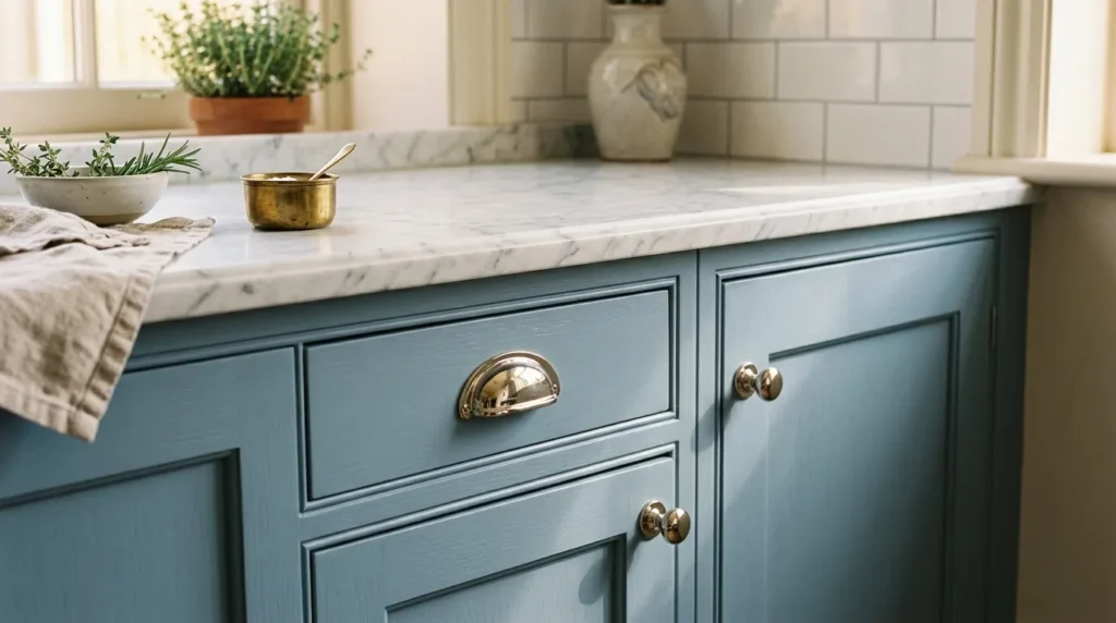
Dusty blue is one of the softer, more muted shades in the blue gray family, and it brings a gentle, timeless elegance to a kitchen that avoids feeling trend-driven the way some bolder or more saturated colors can. That’s why many designers recommend this particular tone specifically for traditional or transitional kitchens, where a more subdued, classic aesthetic is already the goal. Polished nickel hardware and fixtures reinforce that same timeless quality, offering a cooler, more classic metal tone than brass while still bringing genuine shine and sophistication to the space.
How To Style It
Choose a dusty, muted blue gray for cabinetry, leaning toward the softer, grayer end of the blue gray spectrum rather than anything too saturated or bold. Pair with polished nickel cabinet hardware, faucet fixtures, and pendant lighting for a classic, coordinated metal finish throughout. This color and metal combination pairs particularly well with a subtle marble or quartz countertop featuring soft gray veining, and a classic subway tile backsplash in white or the palest blue gray tone keeps the overall look elegant without becoming visually busy.
5. Two-Tone Blue Gray and Warm Wood
Quick Benefits
- Layered, dimensional cabinet scheme
- Warm wood tones balance cool blue gray
- Highly popular current design trend
- Works well in both large and galley-style kitchens
- Adds visual interest without extra ornamentation
Why It Works
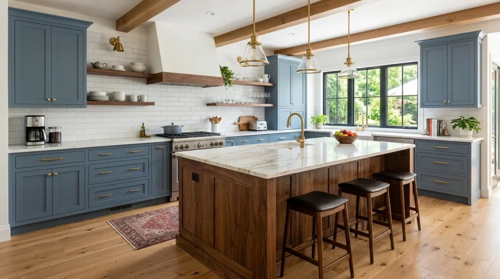
A two-tone kitchen — blue gray on the majority of cabinetry with a warm wood tone on the island or a set of open shelves — has become one of the most popular approaches in current luxury kitchen design, since it introduces natural material warmth without abandoning the sophisticated cool tone of the blue gray itself. In my experience, this combination solves a common complaint about all-blue-gray kitchens feeling a little cold or one-note, since the wood element breaks up the color story and adds genuine material texture that paint alone can’t provide.
How To Style It
Paint the majority of the kitchen’s perimeter cabinetry in a rich blue gray, and use a warm wood tone — walnut, white oak, or a similar mid-tone finish — on the island specifically, or on a set of open upper shelves for a lighter architectural contrast. Coordinate hardware finishes across both cabinet tones, choosing a single warm metal like brass or bronze that complements the wood while still working well against the blue gray. This combination pairs beautifully with a natural stone countertop that echoes tones from both the cabinetry and the wood accent, tying the whole two-tone scheme together cohesively.
6. Navy-Leaning Blue Gray Island Accent
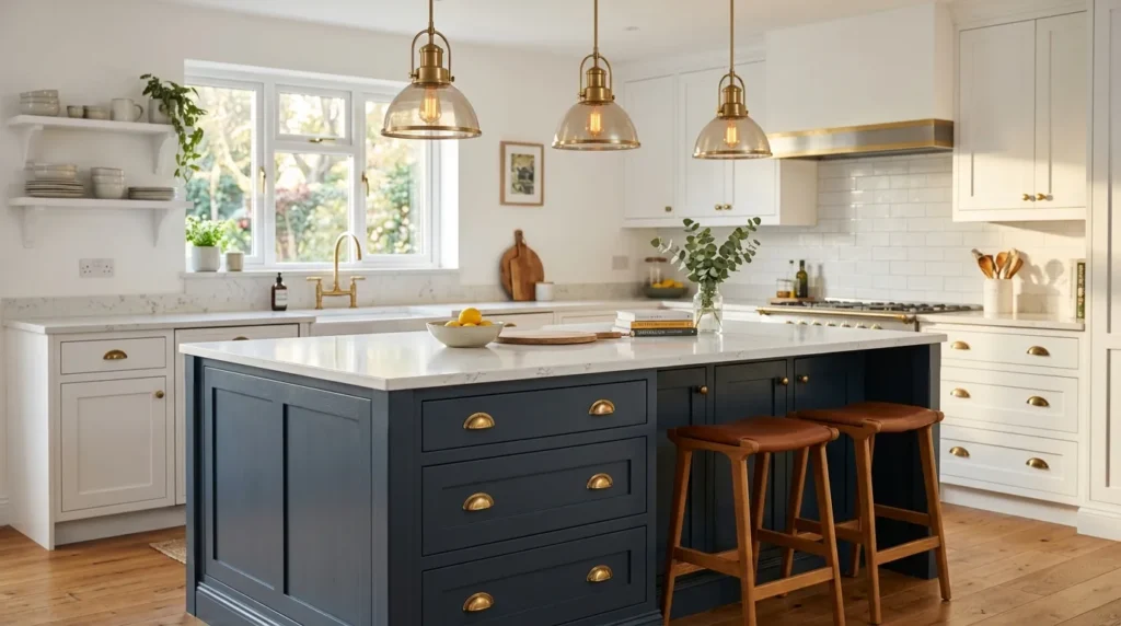
Quick Benefits
- Bold statement without overwhelming the whole kitchen
- Creates a clear visual focal point
- Pairs beautifully with neutral perimeter cabinetry
- Flexible approach for kitchens hesitant about full color commitment
- Elevates the island into genuine furniture-like styling
Why It Works
Using a deeper, navy-leaning blue gray exclusively on the island, while keeping perimeter cabinetry in a lighter neutral tone, allows homeowners to commit to a bold, saturated color in a contained, lower-risk way, while still creating real visual drama in the kitchen’s most central, attention-grabbing piece. That’s why many designers recommend this approach specifically for homeowners who love the idea of a bold blue gray kitchen but are hesitant to commit to the color across every single cabinet in the room.
How To Style It
Paint the island in a deep, navy-leaning blue gray, and keep the surrounding perimeter cabinetry in white, cream, or a soft warm gray for contrast. Choose hardware and lighting fixtures that coordinate across both cabinet tones — a warm brass or aged bronze tends to bridge the two colors particularly well. This approach works especially well with a waterfall countertop edge on the island, further emphasizing the island as a distinct, furniture-like feature separate from the rest of the kitchen’s cabinetry.
7. Blue Gray with Antique Brass and Glass Fronts
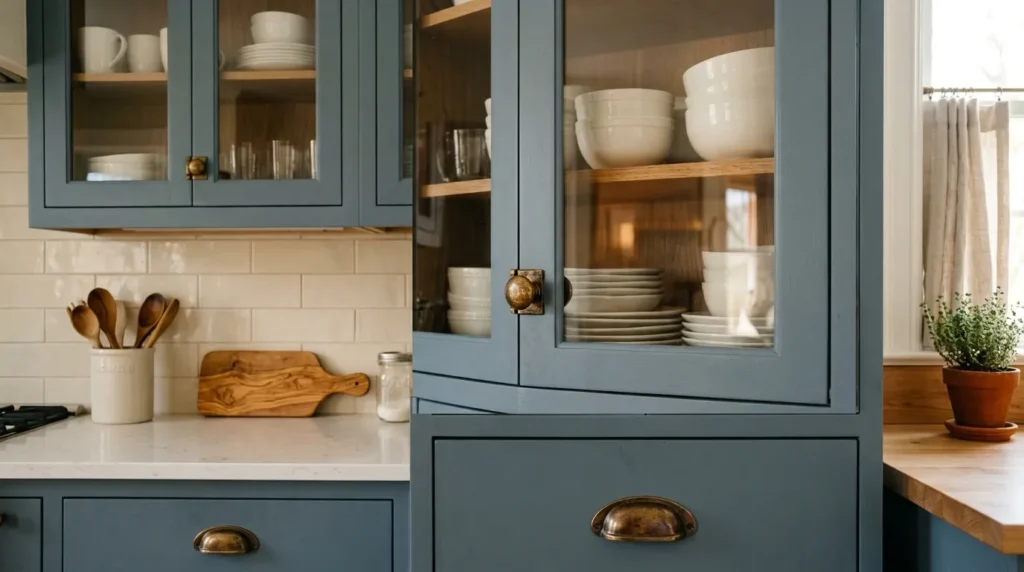
Quick Benefits
- Refined, vintage-inspired luxury look
- Glass fronts add depth and display opportunity
- Antique brass brings warmth and character
- Works beautifully with open shelving accents
- Elevated, custom-feeling finish detail
Why It Works
Glass-front upper cabinets paired with antique or unlacquered brass hardware bring a refined, slightly vintage-inspired quality to a blue gray kitchen, adding both visual depth and a genuine opportunity to display curated dishware or glassware as part of the kitchen’s overall styling. I’ve noticed this combination performs particularly well in kitchens aiming for a timeless, almost heirloom-quality look rather than a strictly modern aesthetic, since the antique brass finish develops a natural patina over time that only adds to the kitchen’s sense of established, collected luxury.
How To Style It
Choose glass-front doors for at least a portion of the upper cabinetry — either a full run or a few accent cabinets flanking a range hood — and pair with antique or unlacquered brass hardware, which will develop a soft, living patina with use over time. Style the glass-front cabinets with a curated, coordinated collection of dishware in white, cream, or a complementary blue gray tone, rather than a cluttered mix of everyday dishes. This combination pairs particularly well with a honed or leathered stone countertop finish, reinforcing the same soft, non-glossy, collected luxury feel found throughout the rest of the kitchen.
8. Coastal Blue Gray with Honed Marble
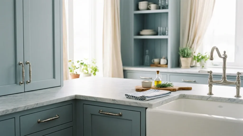
Quick Benefits
- Soft, relaxed luxury atmosphere
- Honed finish adds subtle, matte texture
- Works beautifully in bright, airy kitchens
- Timeless pairing that avoids feeling trend-driven
- Elegant without reading as overly formal
Why It Works
A lighter, coastal-leaning blue gray paired with honed — rather than polished — marble countertops creates a soft, relaxed sense of luxury that feels elegant without tipping into overly formal or glossy territory. That’s why many designers recommend a honed finish specifically for this lighter color palette, since the matte, slightly textured surface of honed stone echoes the same soft, understated quality of the cabinet color, whereas a high-gloss polished finish would introduce a level of shine that doesn’t quite match the relaxed mood this particular blue gray is going for.
How To Style It
Choose a light, coastal-leaning blue gray for cabinetry — closer to a soft seafoam or pale slate than a deep, saturated tone — and pair with a honed marble or marble-look quartz countertop for a soft, matte finish throughout. Brushed or satin nickel hardware complements this palette particularly well, avoiding the higher shine of polished chrome while still bringing a cool, coordinated metal tone to the space. This combination pairs beautifully with natural linen or woven textile elements elsewhere in the kitchen, like window treatments or bar stool upholstery, extending the same relaxed, coastal luxury mood throughout the room.
9. Deep Storm Blue with Gold Accent Lighting
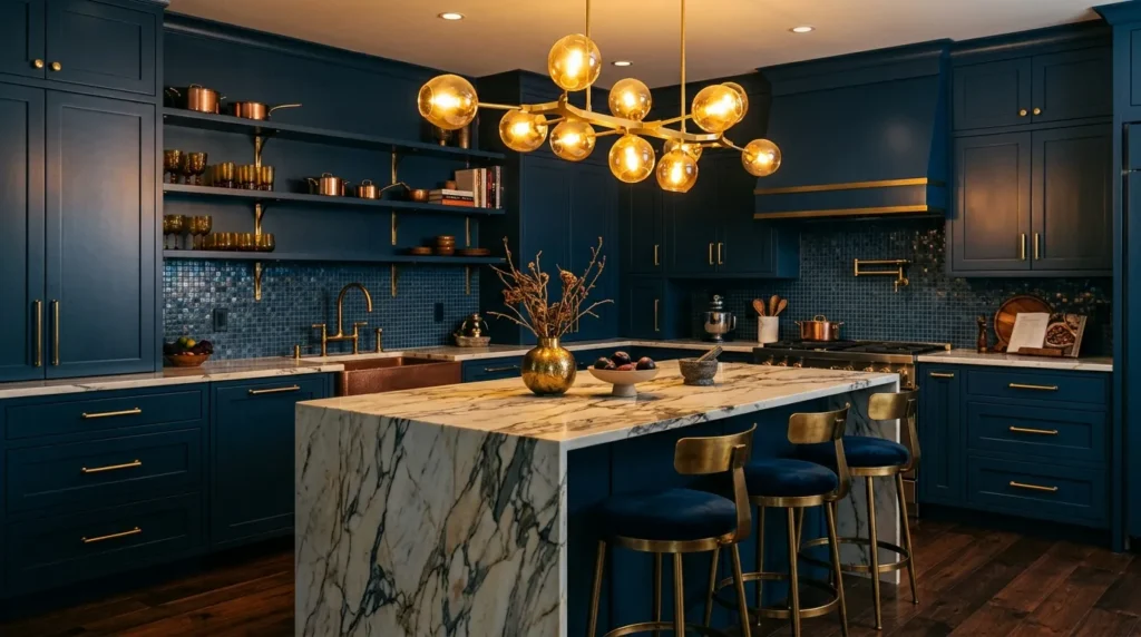
Quick Benefits
- Dramatic, jewel-toned kitchen statement
- Gold lighting adds glamorous warmth
- Bold enough to function as a true design centerpiece
- Works beautifully in larger, well-lit kitchens
- Elevates the kitchen into genuine showpiece territory
Why It Works
A deep, storm-toned blue gray brings genuine drama and richness to a kitchen, functioning almost like a jewel tone within an otherwise neutral home, and it makes a bold enough statement that it can genuinely anchor the design of an entire open-concept living space rather than just the kitchen itself. Gold accent lighting — a statement chandelier or a cluster of pendant fixtures over the island — pushes this look fully into showpiece territory, since the warm, reflective metal catches and plays off the deep cabinet color in a way that flatter, more subdued lighting simply can’t replicate.
How To Style It
Choose a deep, saturated storm blue for cabinetry, ensuring the kitchen has enough natural or supplemental lighting to keep the darker tone from feeling heavy or closed-in. Install a statement gold or brass light fixture — a chandelier, a cluster of pendants, or a dramatic linear fixture — directly over the island as the room’s clear focal point. Pair with a countertop featuring bold, dramatic veining in white, gray, or gold tones to echo the lighting fixture’s warm metal finish, and consider a matching gold or brass faucet to complete the fully coordinated luxury metal story throughout the space.
10. Blue Gray Shaker with Statement Range Hood
Quick Benefits
- Classic cabinet style with an elevated focal point
- Range hood becomes genuine architectural feature
- Timeless door style that won’t feel dated
- Works beautifully across kitchen sizes and layouts
- Balances classic and luxury design elements
Why It Works
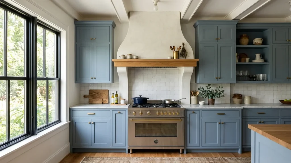
Shaker-style cabinet doors remain one of the most timeless, versatile door profiles in kitchen design, and pairing that classic simplicity with a genuinely bold, statement-making range hood creates a kitchen that feels both grounded and luxurious at once. That’s why many designers recommend this pairing specifically for homeowners who want a kitchen that will still feel current and well-designed a decade from now, since the shaker door style itself carries essentially no expiration date, while the range hood provides the opportunity for a bolder, more current design statement that can be updated more easily than cabinetry down the line.
How To Style It
Choose simple, classic shaker-style cabinet doors in a rich blue gray tone, and invest in a statement range hood — plaster, wood, or a dramatic metal finish — sized generously enough to serve as the kitchen’s clear architectural focal point above the cooking area. Keep the surrounding cabinetry hardware and fixtures relatively simple and classic, letting the range hood carry the bulk of the room’s visual drama rather than competing with several other bold elements at once. This pairing works particularly well with a simple, classic countertop and backsplash, allowing the shaker cabinetry and statement hood to remain the kitchen’s clear defining features.
Frequently Asked Questions
What countertop color pairs best with blue gray cabinets? White or light gray quartz and marble are the most versatile pairings, since they let the cabinet color remain the visual focus without competing for attention. Warmer stone tones can also work well, particularly in two-tone kitchens that already incorporate wood accents.
Does blue gray work in a small kitchen? Yes, particularly lighter or more muted blue gray shades, which tend to feel airy rather than closed-in even in a smaller footprint. Pairing a lighter blue gray with plenty of natural light and reflective hardware finishes helps keep a smaller kitchen feeling open.
What hardware finish looks most luxurious with blue gray cabinets? Brushed brass, antique brass, and polished nickel are among the most popular luxury pairings, since warm metals in particular balance the coolness of blue gray tones effectively. The right choice ultimately depends on whether the kitchen is leaning warmer or cooler overall in its other finishes.
Is blue gray a trendy color that will feel dated quickly? Blue gray has remained a popular, enduring choice for several years now, and because it sits between classic neutral gray and a more distinctive blue, it tends to age more gracefully than trend-driven colors. Choosing a more muted, complex shade rather than a flat, saturated blue further supports its longevity.
Should all my kitchen cabinets be the same blue gray shade? Not necessarily — two-tone kitchens, where blue gray appears on either the perimeter or the island alone, paired with a contrasting neutral or wood tone, are extremely popular and can feel just as luxurious as an all-blue-gray kitchen. The right approach depends on the overall look and level of contrast you’re going for.
What backsplash works best with blue gray cabinets? A simple white or cream subway tile, a classic marble herringbone pattern, or a full slab of matching or complementary stone all work beautifully with blue gray cabinetry. The backsplash choice often depends on how much visual pattern or texture is already present elsewhere in the kitchen’s design.
How do I keep a blue gray kitchen from feeling cold? Incorporating warm elements — brass or gold hardware, wood accents, warm-toned lighting, or natural textiles — balances the inherently cool undertones of blue gray and keeps the space feeling inviting rather than sterile. A completely cool-toned kitchen with no warm counterpoints is where the “cold” feeling most commonly comes from.
Final Thoughts
Blue gray remains one of the most versatile, sophisticated choices in kitchen cabinetry precisely because of how much range it offers — from soft, coastal-leaning shades to deep, dramatic storm tones, each capable of supporting a completely different finish story. The color itself sets the foundation, but it’s the hardware, countertop, lighting, and backsplash choices layered on top of it that ultimately determine whether a kitchen reads as simply nice or genuinely luxurious.
Start by deciding on the overall finish level and mood you’re aiming for, then choose the specific blue gray shade and metal pairing that supports that vision, rather than picking the color first and building everything else around it after the fact. A well-considered blue gray kitchen has real staying power, offering the kind of timeless sophistication that holds up well beyond any single design trend.
Related Articles
- Modern Living Room Ideas with Soft Organic Textures
- Neutral Home Decor Inspiration
- Farmhouse Kitchen Decorating Ideas
- Kitchen Backsplash Ideas for Every Style
- Best Kitchen Cabinet Hardware Trends